

The Mummy by Faith Erin Hicks - Comic Review
Ancient curses, modern identity—The Mummy rises again in a beautifully haunted reimagining.

Confession time.
I was never really a big fan of horror. Back in the day, we used to crowd into those VIP rooms at internet cafes and binge horror flicks with the gang, but aside from a handful of memorable ones (and I’m being generous here), the genre never truly hooked me.
Sure, there were jump scares—but if I wanted to feel terrified, I could just watch the nightly news.
That said, when I picked up The Mummy a few weeks ago, I was genuinely excited. The original Mummy movies are among the few horror classics I’ve actually enjoyed. I’ve always been more into creature features than slashers—werewolves, vampires, mummies… that’s my jam.
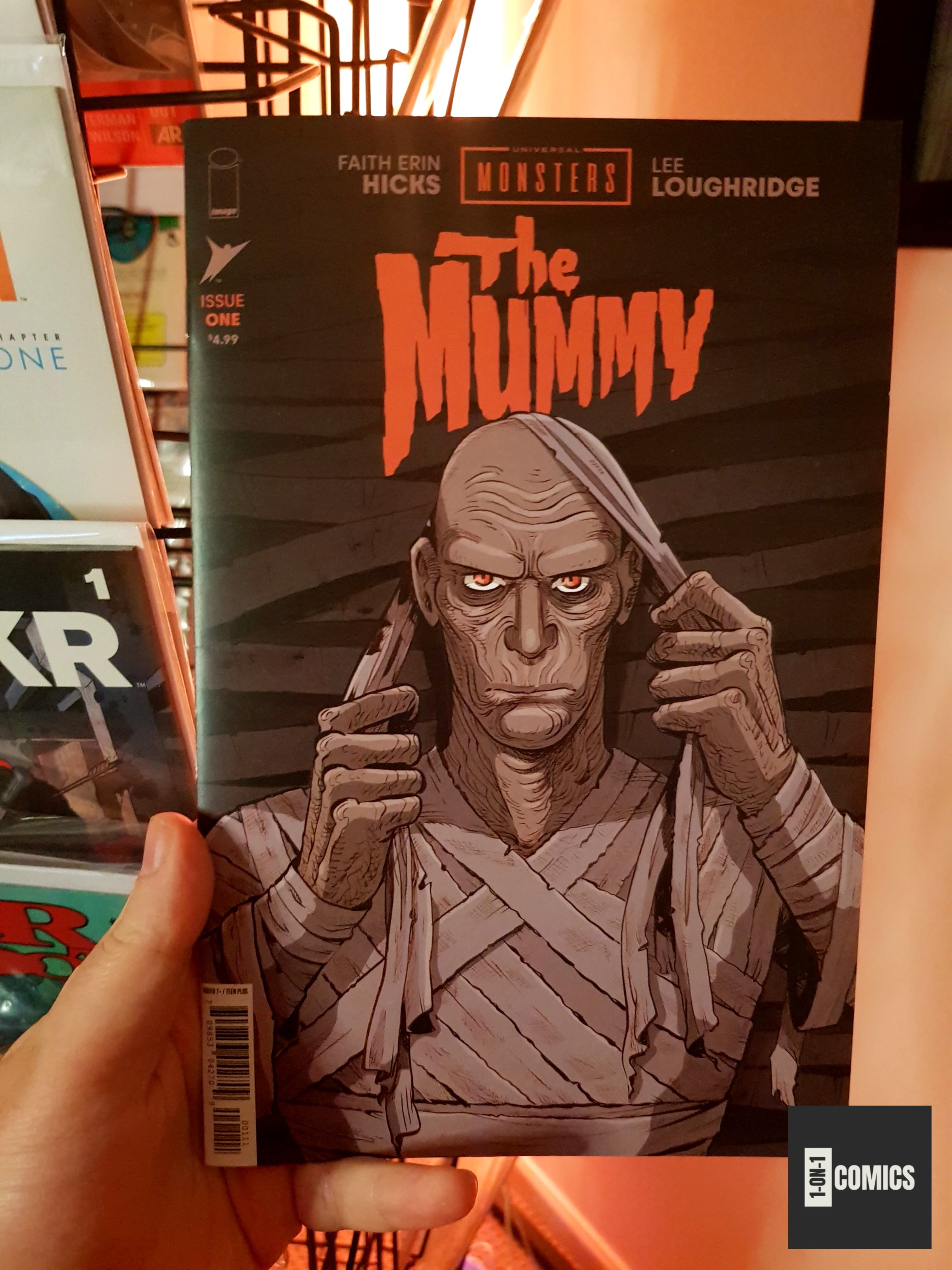
So when I spotted Universal Monsters: The Mummy on the shelf, I instinctively grabbed it. I hadn’t read any reviews and didn’t know what to expect, but seeing Faith Erin Hicks on the cover gave me that final push.
I’m glad it did.
Story
Universal Monsters: The Mummy opens in 1920s Thebes, introducing us to Helen, a young woman of mixed heritage—half Egyptian, half British. The first issue centers on her struggle to find a place in a society where she’s both of the people and of the colonizers.
It’s hard to bond with rebellious local teens when your family controls most of the jobs and wants to dig up their ancestors.
The plot loosely follows the bones of the original Mummy story. For those unfamiliar, here’s the quick version:
Ancient priest dies (bad breakup, buried alive—classic).
Gets resurrected 3,000 years later by nosy archaeologists.
Throws on some ancient linens and starts stalking a modern woman he thinks is his reincarnated lover.
Goes from “Hey, I think we dated in a past life” to “Let’s get embalmed together.”
Spoiler: things go south.
Art
Faith Erin Hicks brings a unique visual style to this adaptation, blending expressive linework and cinematic panel design with a gothic horror aesthetic. Her art captures the dusty, haunting feel of 1920s Egypt while still feeling personal and grounded.
There’s a subtle cartoonish charm in her characters, but it’s balanced by emotional depth and a textured ink wash that gives the pages a vintage, almost film-grain feel.
Colorist Lee Loughridge complements this perfectly with a moody, subdued palette that enhances the supernatural tones and somber mood. His colors deepen the tension and give the world a sense of lived-in eeriness.
Together, Hicks and Loughridge deliver a respectful and visually rich homage to the 1932 original—familiar yet fresh, and just creepy enough to make you keep the lights on.